One of my many hobbies is woodworking. In an effort to make this hobby a bit more self-sustaining, I began marketing my wares under the brand name "Seymour Woodworks".
Using this as an exercise in logo design, I created a logo for myself that I could use for social media and print collateral.
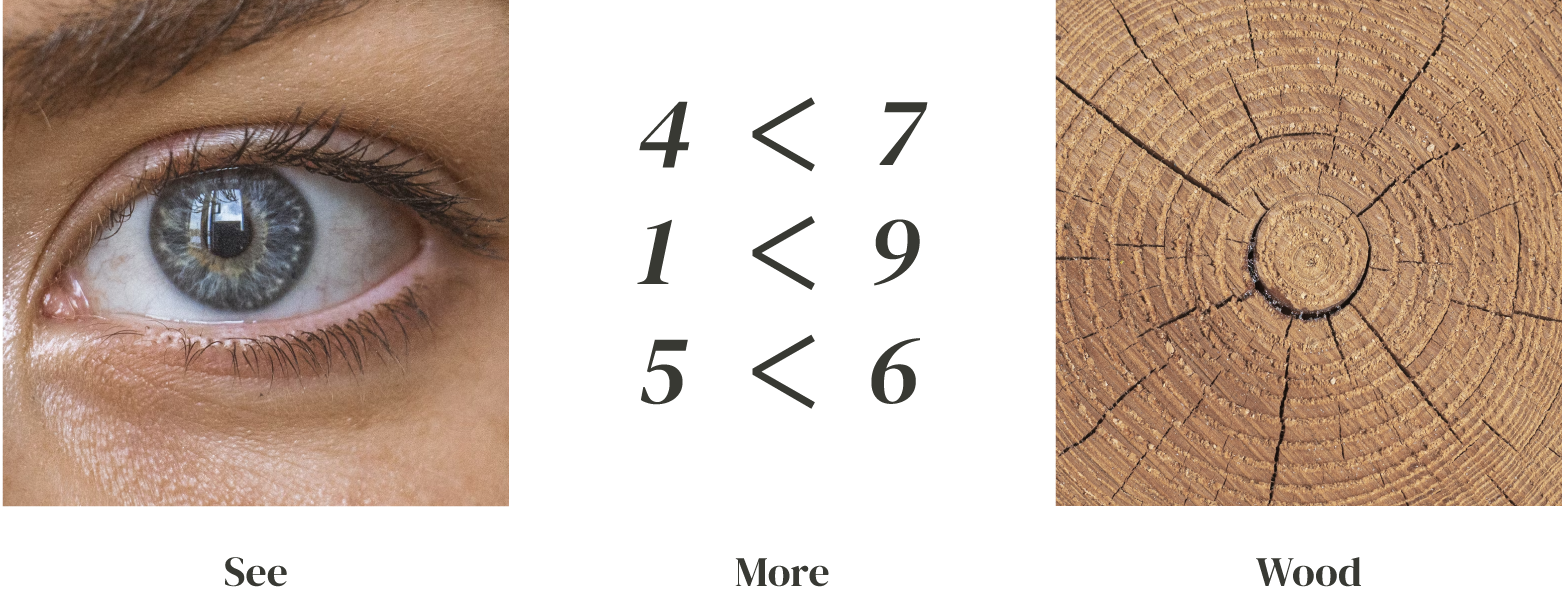
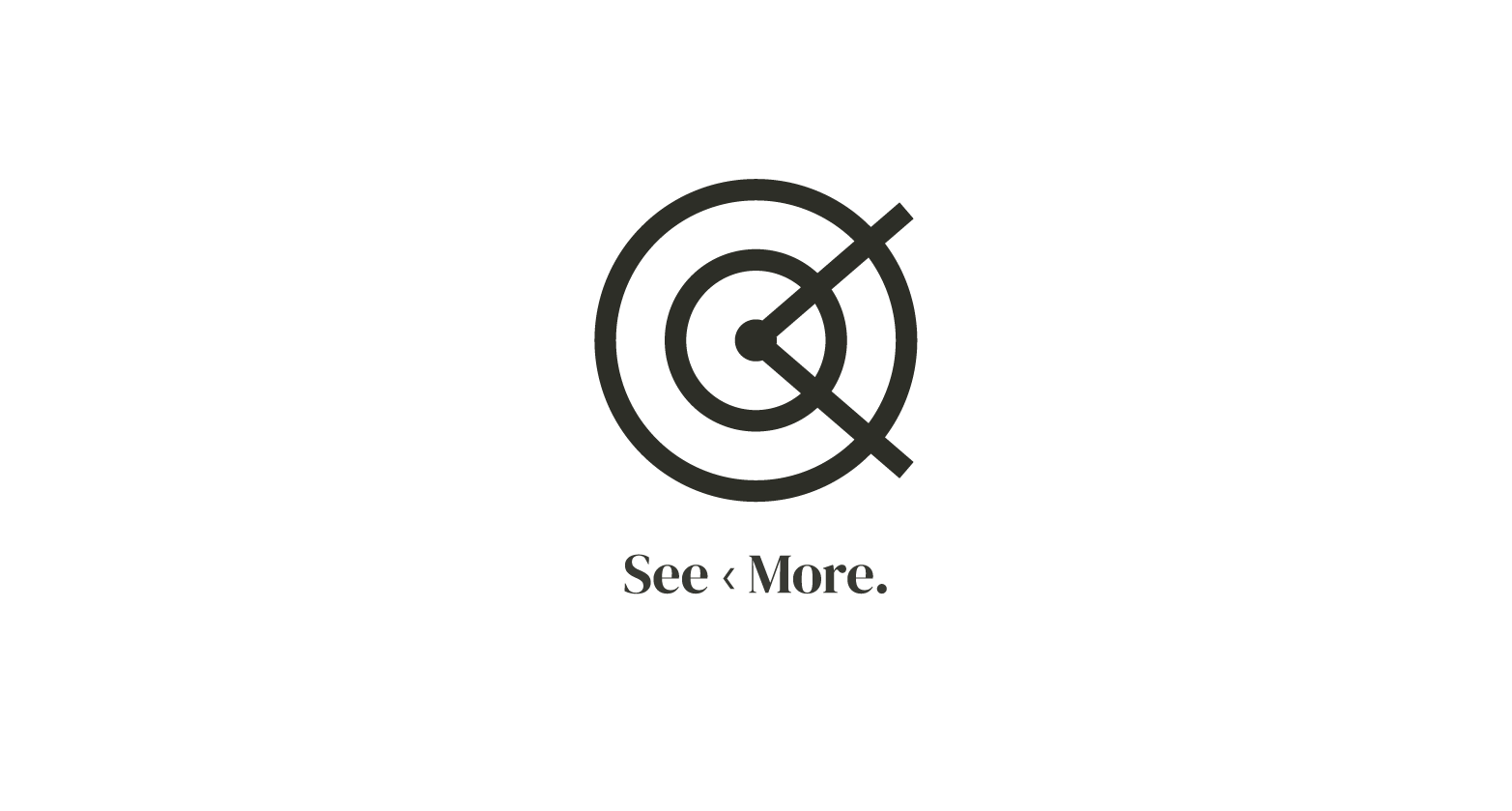
I took a play on my last name by breaking it down into its phonetic parts: "see" + "more". From there, I used symbols to represent these separate elements and landed upon my logo you can see below. In a market dominated by logos with wavy trees, saw blades, rustic fonts, and other literal interpretations of 'woodworking', I wanted to make sure I stood out with a precise, clean, and abstract logo.
I made sure to strike a balance between a bit of retro (and familiarity), upscale (design-focused), and still have a natural tie-in. For my print collateral, I took inspiration from the old drafting notepads and timeless type-heavy advertisements of the 90's (Apple, Porsche, etc.).

Usage and care instruction postcards

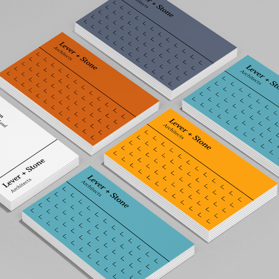
Business cards